Basic visualization in Julia – Gadfly
In this post, we will walk through the basics of Gadfly – a visualization package written in Julia. Gadfly is Julia’s implementation of the layered grammar of graphics proposed by Hadley Wickham, who implemented his idea into the ggplot2 package, the main visualization library in R. Interestingly, the original inventor of the “grammar of graphics” (who inspired Wickham) is now employed by Tableau Software – a leading company in data visualization.
The main motivation for the grammar of graphics is to formalize visualization for statistics. Authors use the word “grammar” so one can think of a set of rules that let you build “correct” (with respect to the given grammar) sentences. In this case, though, the sentence is graphical, so one can see the output in the form of a plot.
Let’s now try to provide a declarative description of what a plot is and then use this knowledge to actually plot stuff.
Plot consists of:
-
Aesthetics – It can be understood as the plot interface for data. Data is bound to aesthetics. Different aesthetics are expected for different kinds of plots. For example, to plot a set of points one can use geometry
Geom.point(don’t worry yet – geometry is explained in a minute) that requires aesthetics x and y. In other words, these aesthetics are always known at the time of plot creation. Knowing what you want to plot, there is always a specification of what aesthetics the chosen geometry requires – so it is not an art but rather a craft to choose proper aesthetics. -
Geometries – Geometry defines what will be plotted, i.e., the geometry of your data. Each geometry requires a set of aesthetics to work. Please take a look at the specification of
Geom.point– it requires aestheticsxandyas noted above. Different kinds of geometries define different plots. The geometry is then a central point of your plot – geometries and aesthetics define what you want to plot while other components specify how you want to do it. -
Statistics – It is a middle layer between the provided aesthetics and geometry. So whenever you provide aesthetics for a given geometry, there is corresponding statistics in the middle – very often that statistics is simply “identity” (like in the case of
Geom.point). -
Scales – To transform axes of your plot (e.g., to apply a log-scale to the x-axis in a scatterplot, one can use
Scale.x_log10). -
Guides – Elements responsible for plotting axis labels, titles, etc.
Ok, having that basic knowledge, let’s try to play with Gadfly a bit. Installation of the package is as easy as:
1
Pkg.add("Gadfly")
It’s recommended to install Cairo, which serves as a PDF/PS/PNG backend (in case you want to export your plots):
1
Pkg.add("Cairo")
We will need a dataset to play with. It’s probably a good time to mention RDatasets package that gives Julia programmers access to R datasets.
Let’s quickly install and load it:
1
2
Pkg.add("RDatasets")
using RDatasets
For the purposes of this post, we will work with the sleepstudy dataset from the package lme4. We will be looking at certain tasks’ reaction times of people who were sleeping less than recommended for 9 days in a row (details of the dataset here).
1
sleep = dataset("lme4", "sleepstudy")
Let’s first list the columns of the sleep DataFrame:
1
2
3
4
5
names(sleep)
3-element Array{Symbol,1}:
 :Reaction
 :Days
 :Subject
Reaction is the reaction time in milliseconds, Days represents the day number of sleep deprivation, and Subject is the subject ID.
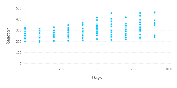
Ok, let’s first take a look at a scatterplot of day number and reaction time with no subject distinction. To plot a scatterplot, we need to use Geom.point geometry and attach proper columns to x and y.
1
plot(sleep, x = "Days", y = "Reaction", Geom.point)
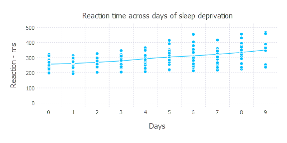
We can append another layer to the plot function, Geom.smooth – to fit a smooth curve to the provided dataset; it does not require additional aesthetics.
1
plot(sleep, x = "Days", y = "Reaction", Geom.point, Geom.smooth)

Not perfect yet—we still would like to have the x-scale be discrete. One can use Scale.x_discrete to force it. Moreover, let’s point out that Reaction time is measured in milliseconds and set a title for our plot. Guide will help us here.
1
2
plot(sleep, x = "Days", y = "Reaction", Geom.point, Geom.smooth, Scale.x_discrete,
     Guide.ylabel("Reaction - ms"), Guide.title("Reaction time across days of sleep deprivation"))
Now let’s say we would like to investigate general reaction ability for every subject. Let’s say we want a density plot that shows reaction time.
1
plot(sleep, x = "Reaction", Geom.density, color = "Subject", Scale.x_continuous(minvalue= 0, maxvalue= 500))
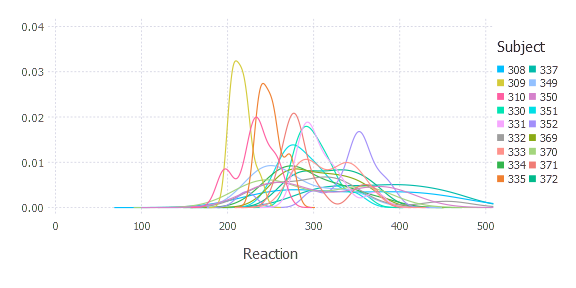
This shows individual variances of reaction time. You can note that Subject 309 is probably a machine or at least an immortal human.
How do these values look across different days?
1
plot(sleep, x = "Days", y ="Reaction", Geom.point, Geom.smooth, color = "Subject", Scale.y_continuous(minvalue = 200, maxvalue = 500))
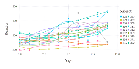
(By the way, if you are reading this late at night, it’s probably a good reason to go to sleep.)
All plots above required a dataframe as input. It is not mandatory, of course. One can provide a data vector directly to aesthetics.
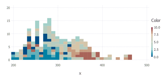
1
plot(x = sleep[:Reaction], Geom.histogram(bincount = 30), Scale.x_continuous(minvalue = 200), color = sleep[:Days])
Another convenient way is to stack many layers on one plot. Let’s say we want to compare the reaction time of Subject 309 and Subject 310 on one plot.
1
2
3
4
5
plot(
     layer(x = sleep[:Days][sleep[:Subject] .== "309"], y = sleep[:Reaction][sleep[:Subject] .== "309"], Geom.point, Geom.smooth, Theme(default_color=color("red"))),
     layer(x = sleep[:Days][sleep[:Subject] .== "310"], y = sleep[:Reaction][sleep[:Subject] .== "310"], Geom.point, Geom.smooth, Theme(default_color=color("blue"))),
     Guide.xlabel("Days"), Guide.ylabel("Reaction time - ms")
)
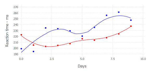
Please note the Theme argument provided to each layer. Using Theme, you can set plot parameters such as: default_color, point size, font size of x-label, font size of y-label, and many more. More about themes here.
As you can see, Gadfly gives you quite a flexible environment when it comes to visualization. Let’s try to summarize plotting in Julia with Gadfly. It is not painful at all and is very friendly for R users. It gives flexibility to the users; after some time of playing with it, I find it more and more convenient.
If you want, you can check out some more advanced examples of Gadfly plotting. Take a look here. “Grammar of Graphics” – which I would guess is a classic – is available on Amazon.
int8